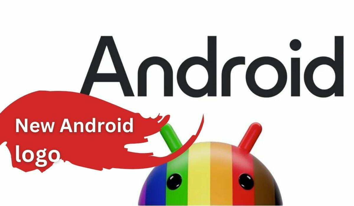
What’s New in Google Android Logo
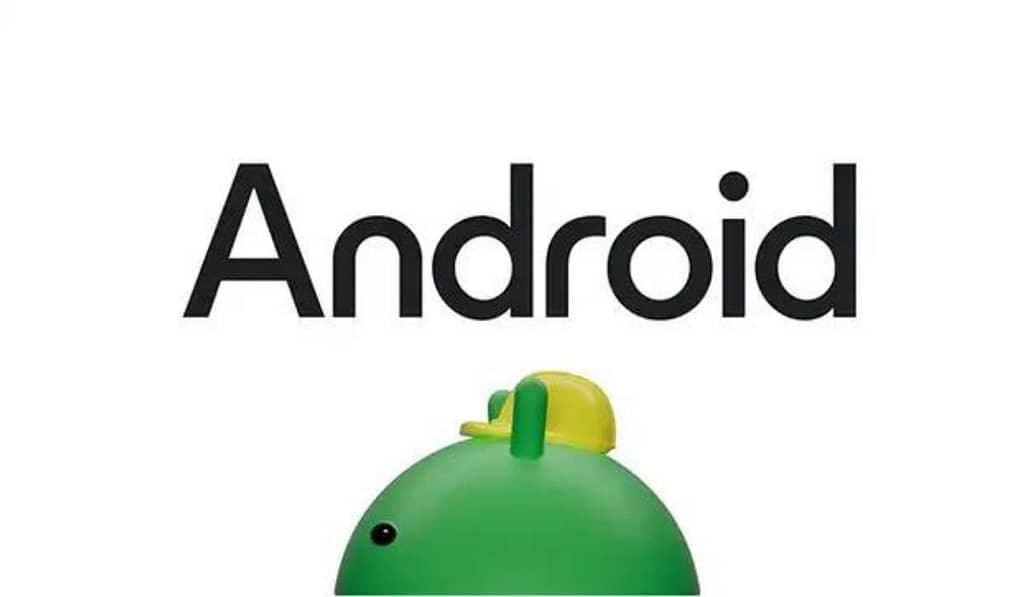
Google has introduced a fresh iteration of the official Android logo, marking a significant change in the Android branding. The new android logo draws inspiration from Google’s Material design principles, aligning it more closely with the iconic Google logo. One prominent alteration is the capitalization of the ‘A’ in Android, deviating from the previous all-lowercase style. This transformation creates a visual harmony between the Android operating system logo and Google’s brand palette. Furthermore, the Android mascot, Bugdroid, has undergone a remarkable makeover, boasting an entirely new 3D look that adds depth and character to the logo.
What’s New in Google Android Feature Drop
Google’s latest Android feature drop brings a host of enhancements to the Android ecosystem. One highlight is the redesign of the ‘At a Glance’ widget, offering users more detailed information on weather updates, travel itineraries, event reminders, and more. This update also incorporates the Material You design, enhancing the widget’s aesthetics and functionality.
Additionally, Google Wallet now allows users to upload images of passes with barcodes or QR codes, providing a convenient digital storage solution for various cards, such as gym memberships and library cards. The Image Q&A feature on Lookout has been enhanced with AI capabilities, enabling more detailed image descriptions to improve accessibility for individuals with vision impairments. Moreover, Android users can enjoy audio Zoom calls via Android Auto, seamlessly integrate Fitbit and Google Fit activity and sleep data into personal Routines, and more.
Is Google Putting a Stamp on the New Bugdroid Logo?
With the introduction of the revamped Bugdroid logo, Google is making a bold statement in its commitment to evolving the Android brand. The new Bugdroid design aligns with Google’s Material design philosophy, giving it a fresh and dynamic 3D appearance. This redesign aims to ensure that Bugdroid remains a versatile and reliable symbol across various digital and real-life environments, platforms, and contexts. Google’s emphasis on Bugdroid’s adaptability underscores its intention to put a distinctive stamp on the new logo, solidifying it as an integral part of the Android brand.
What Is the New Bugdroid Logo and Android Watermark?
The new Bugdroid logo represents the iconic Android mascot, which has been reimagined with a 3D look. This updated design adds depth and character to Bugdroid, aligning it with Google’s Material design principles. The Android watermark serves as a visual signifier of the Android brand and is closely associated with the Android operating system logo. The watermark reinforces the Android branding across various platforms and contexts, making it recognizable and adaptable. As Google continues to innovate and enhance the Android ecosystem, the new Bugdroid logo and Android watermark play crucial roles in representing the brand’s evolution and identity.
Frequently Asked Questions (FAQ)
What is the significance of the new Android logo?
The new Android logo signifies Google’s commitment to evolving the Android brand. It draws inspiration from Material design principles, capitalizing on the “A” and rounding the “n” and “r” in the wordmark to align more closely with the Google brand palette.
What is Bugdroid, and how has it evolved in the Android logo?
Bugdroid is the iconic Android mascot. Over the years, it has undergone several transformations, from a full-bodied representation to a refined “head” in 2019. The latest redesign introduces a striking 3D avatar, bringing back the robot’s full physique.
How does the new Bugdroid logo reflect Android’s adaptability?
The new Bugdroid logo, inspired by Material design, prioritizes adaptability. It seamlessly transitions between digital and real-life environments, mirroring Android’s ability to evolve and adapt to changing technology landscapes.
Are there different versions of the new Bugdroid logo?
Yes, the new Bugdroid logo is dynamic, much like the Android platform itself. It can take on various appearances, offering creative opportunities for artists and creators to explore.
What changes have been made to the Android wordmark?
Previously, “android” was presented in lowercase letters. The new wordmark capitalizes the “A” and rounds the “n” and “r,” creating a visual synergy with the Google logo and enhancing the connection between Android and Google.
How will the new Android logo and wordmark be used?
The new Android logo and wordmark will appear in various contexts where Android connects with people, communities, and cultural moments. They symbolize Google’s dedication to innovation and meaningful user experiences.
Does the new Android logo affect the official Android logo?
Yes, the new Android logo is the official logo for the Android operating system. It represents the brand’s evolution and adaptability, reflecting Google’s commitment to innovation.
What about the Android version logo and “Powered by Android” logo?
The Android version logo and “Powered by Android” logo may retain their existing designs, but they will complement the new Android logo, creating a cohesive visual identity for the Android ecosystem.
See Also https://americpulse.com/how-netflix-helped-south-korean-cinema-go-global/